App Redesign
Cognito Forms, a prominent SaaS product allowing its users to build online forms, was approaching its 10th birthday, and while it had grown in its feature set, its design hadn't been updated since its inception. I had previously led two other designers in overhauling the design language and marketing website of Cognito Forms to resonate with a more sophisticated audience, so the contrast upon logging into the app was stark. On top of the outdated design, several parts of the UI were cumbersome and needed an update as well.
The need for change was clear so when the opportunity came, the product design team jumped into redesigning the Cognito Forms app.
The Process
Throughout the redesign process, we balanced user feedback with the requirements of product managers. Before starting on the redesign, we sought out customer pain points by talking to the Customer Success team and ended the project by conducting several rounds of usability tests which informed several tweaks to the original Figma design and updates to our nascent design system. All along the way, I led my team in balancing business objectives, visual design, and usability concerns.
Cleaner Look
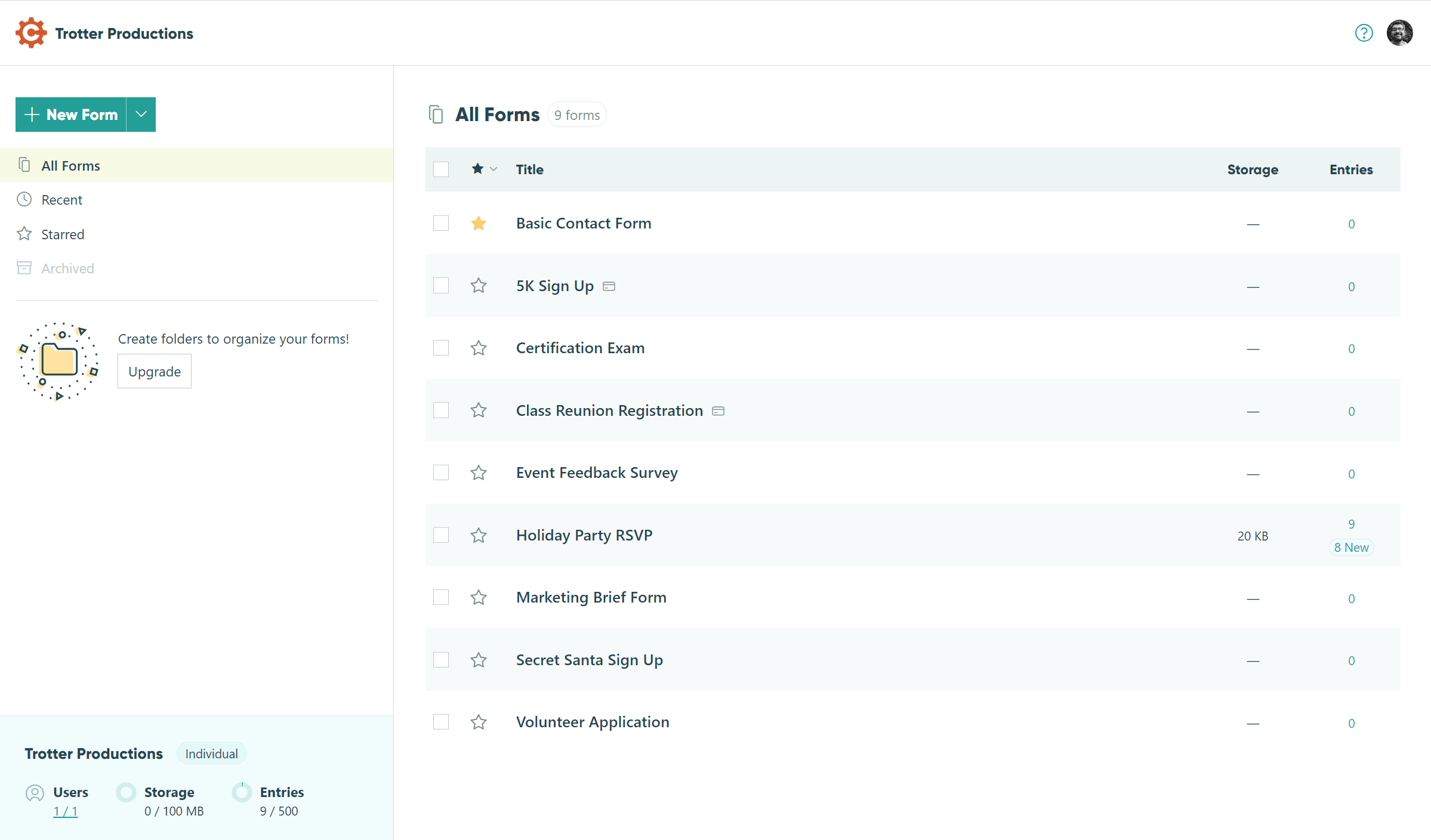
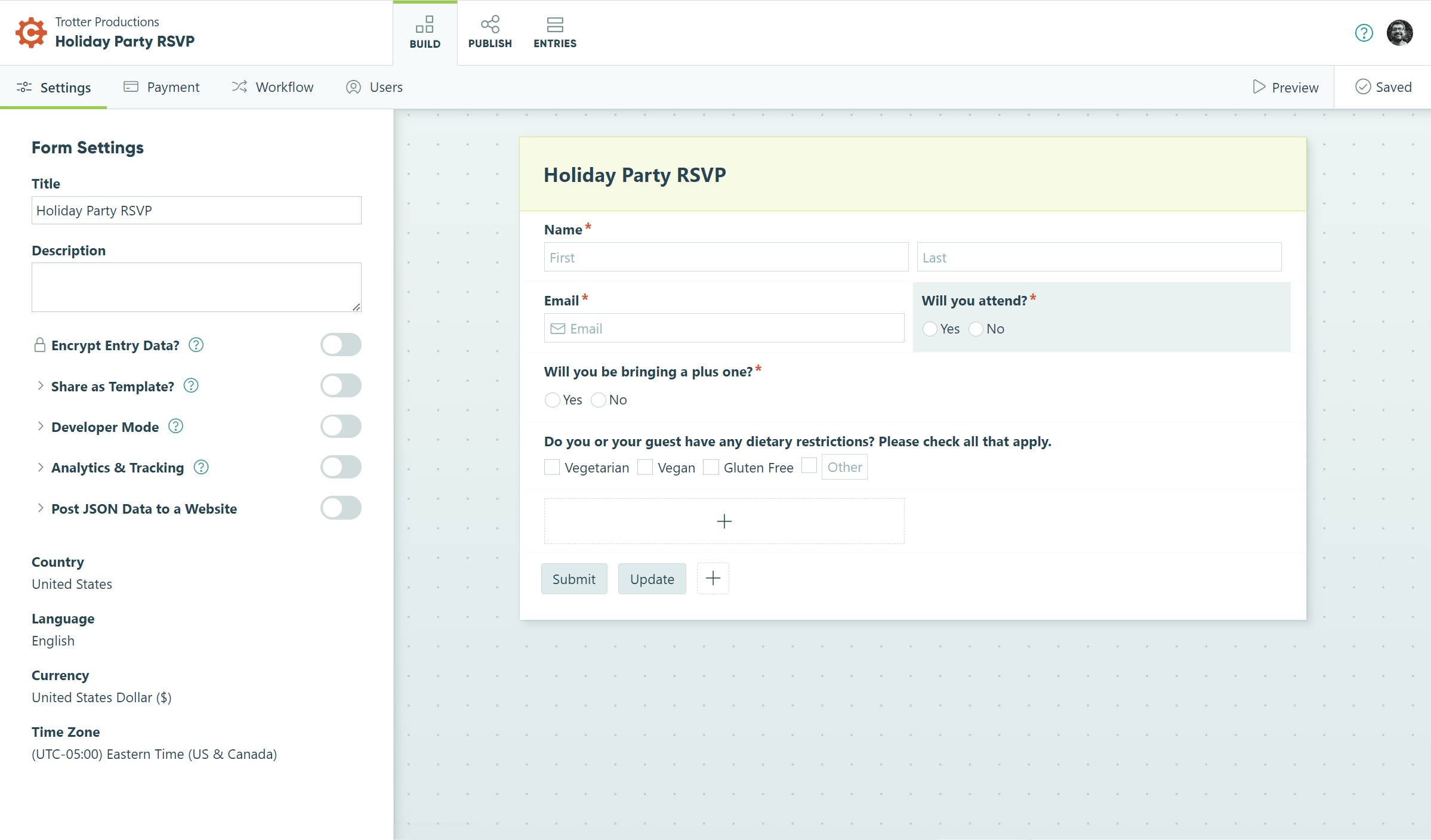
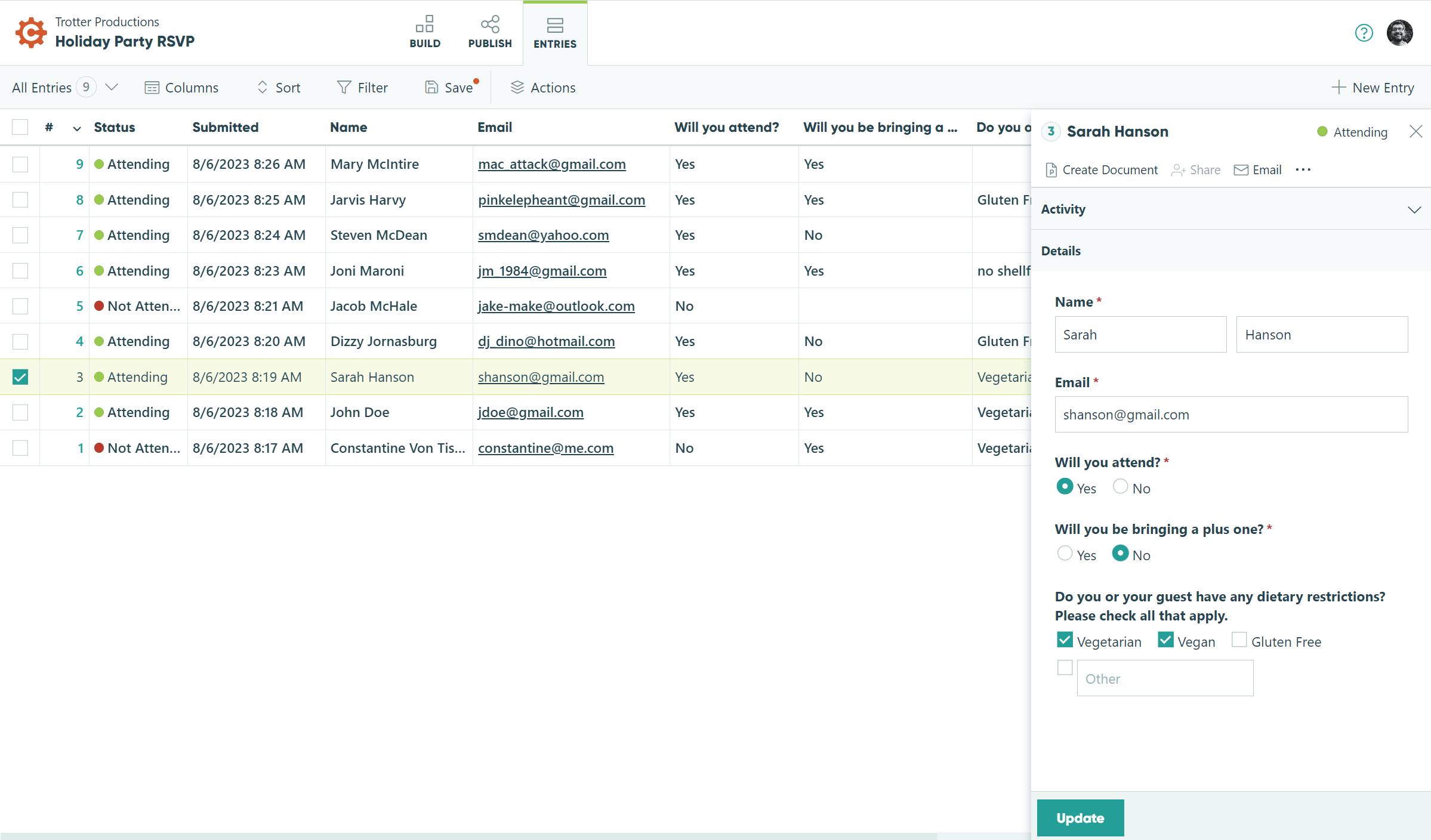
We had already redesigned the marketing website to look more sophisticated. While still quite colorful, our marketing website’s use of those same colors is now more restrained than before. Wanting to bring that sophistication to the app, the design became even more restrained since it is a productivity tool, not a website. We balanced this open airy look with thoughtful customer and stakeholder feedback that felt we had gone too far. We reintroduced some lines and fields of color to explicitly mark section divisions where we had relied on whitespace before.


Typography
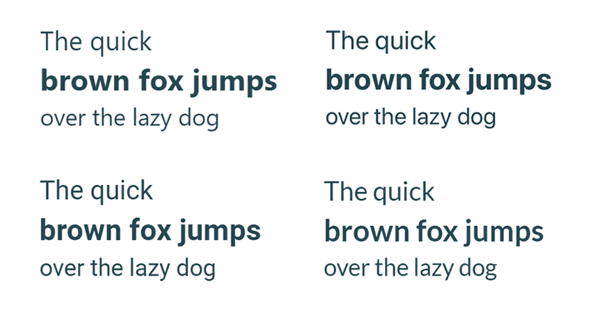
Our brand uses two typefaces, Gilroy as a display typeface and Lato as a text typeface. We started the app redesign using Lato as the go-to typeface for all the text but headings. After kicking the tires with the blossoming interface, project managers began to have reservations about the legibility of that typeface and recommended the design team explore other options, including using the system font. (I.e. Segoe UI for Windows, Roboto for Android, and San Francisco for Apple devices)
We briefly explored using the Inter typeface, quite commonly used for app interfaces. Inter’s main appeal was that it looked similar to all the system typefaces it could be used on any platform ensuring visual consistency. However, in the end, we opted to use system typefaces which are all quite well-made.
We decided to follow the trend set by several companies that use system typefaces for their apps and continue to use a special typeface in our marketing website and print materials. That is, we stuck with Lato in those contexts.


Iconography
We spent some time fine-tuning our custom icon set. Originally the very fine lines of the icons were not snapped to pixels, which resulted in a slightly blurry icon on lower-quality monitors. While high-end monitors are becoming more and more ubiquitous, they’re not quite there yet so we took the time to resize and snap the icons to get them as sharp as possible.
Perfecting the Navigation
While much of this project was limited to only updating the visual design, we did fundamentally rethink the app’s navigation.
One big challenge we faced was appropriately organizing the list of a user’s forms as well as a list of the user’s organizations. Each organization would have its own list of forms and a user could have several organizations tied to his or her account. We tried various arrangements before finally settling on having the form picker accessible from a menu on the left and the organization picker in a separate account menu on the right, accessible by clicking on the user’s avatar. We kept an agile process and an open mind all along the way and tried different ideas in Figma and code. We UX tested several different UIs, including making switching organizations accessible from the same menu as the form picker, but separating the two menus resulted in the clearest mental model for most people.
The Outcome
We embarked on an app redesign that resulted in a dramatic transformation, both visually and, to some extent, functionally. Collaborating closely with product managers, my team meticulously refined every aspect of the app to create an interface that was not only more sophisticated looking, but also more intuitive to use. Through an iterative design and user testing feedback loop, we crafted an experience that surpassed expectations, leaving both business stakeholders and users delighted.
Create an account at Cognito Forms to see our work in action!
