The UX of Creating Views
Challenge
Cognito Forms sought to boost the visibility and use of data views within its form-building platform. While the platform already supported sophisticated use cases involving data filtering and sorting for diverse contexts and saving the results, many users who could have benefited from these advanced features were unaware of them, hindering the platform's full potential.
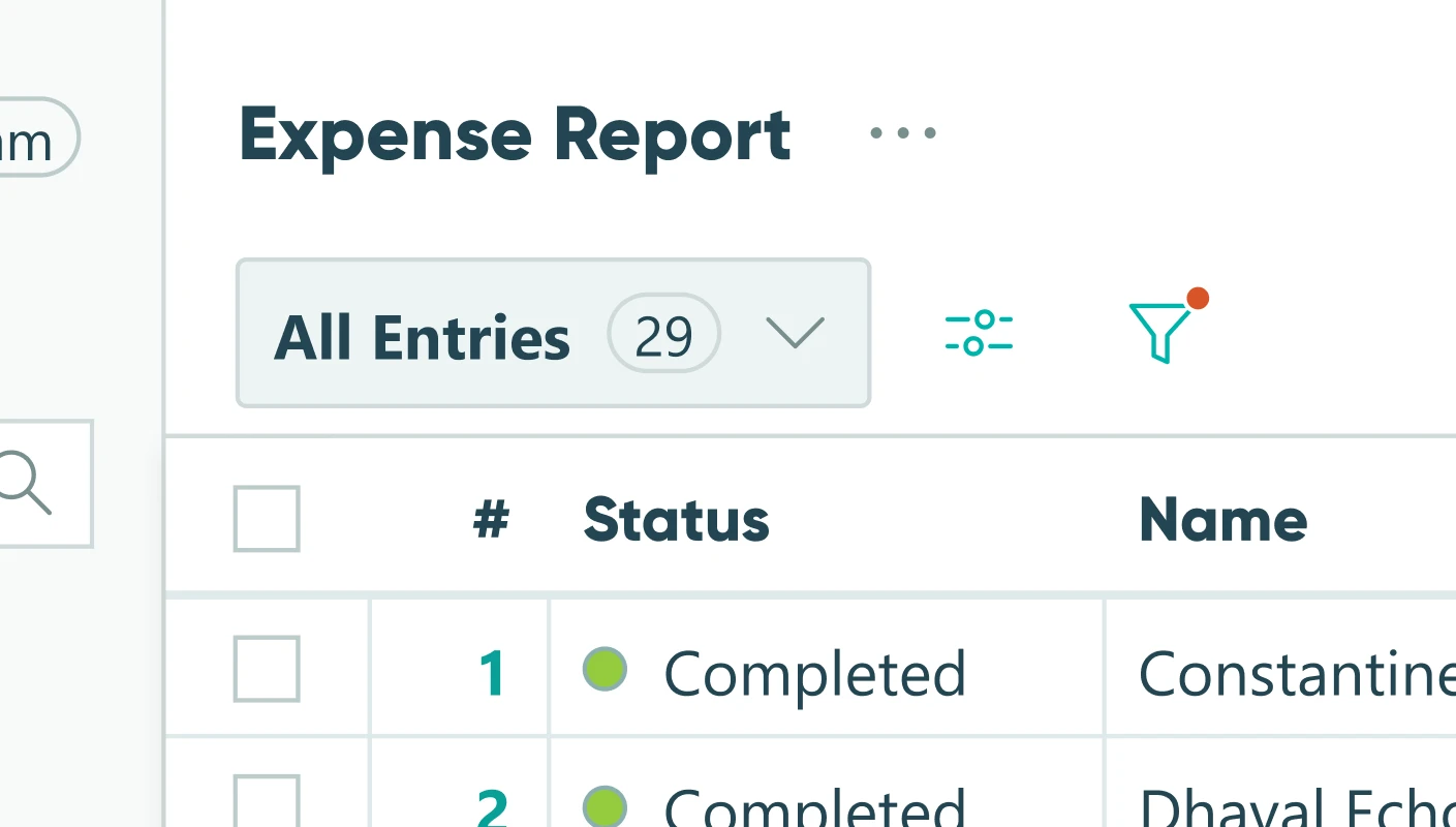
However, the scope of the problem was uncovered during an initiative to make views easier to access—not change how they were managed or discovered. Development resources were constrained by the high volume of other changes and the initial goal was to not dramatically change view management.
My Role
I was responsible for leading the product design team in:
- Brainstorming and iterating on prototype designs
- Conducting user interviews with existing customers
- Synthesizing research findings into a report and presenting it to the product team
- Presenting solutions and prototypes to stakeholders
- Conducting follow-up user testing to validate the new design
Process
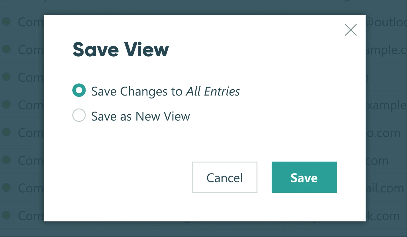
User interviews revealed significant usability problems with both the existing and a slightly modified interface for managing views. Users struggled to create and save new views, often resorting to ad-hoc filtering or unintionally overwriting their primary "All Entries" view. I presented these findings, including statistics and video clips from user testing, and persuasively illustrated the severity of these issues which led the product managers to allocate time for the design team to go back to the drawing board.
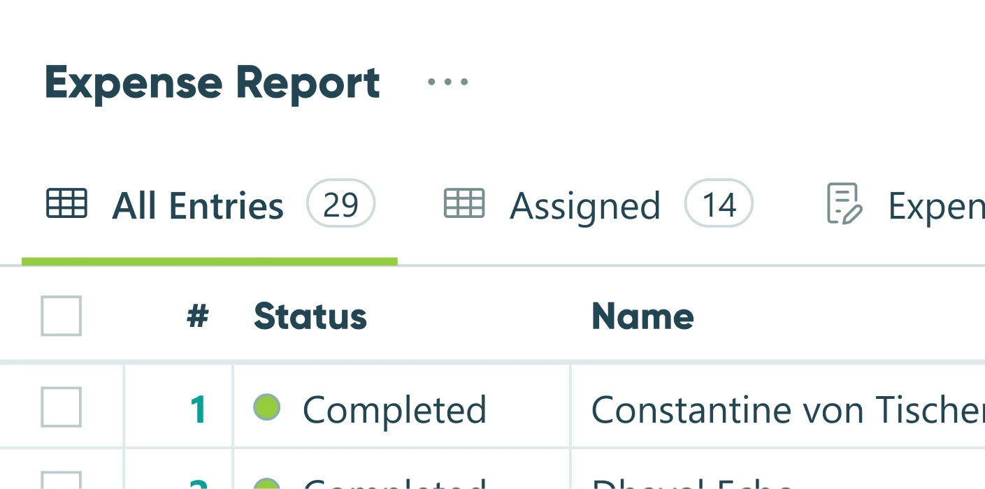
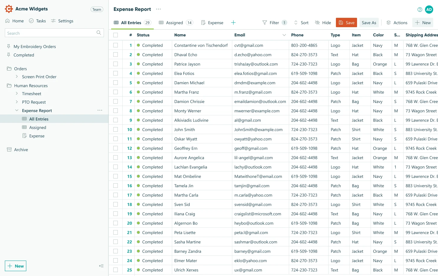
We ultimately adopted on a tab-based approach which was explored earlier but initially dismissed to minimize interface changes. The tabs, along with other tweaks more clearly communicated the ability to create multiple distinct views. After working out all the details in this new paradigm, we validated the new design through further user testing, confirming its improved usability.
Results
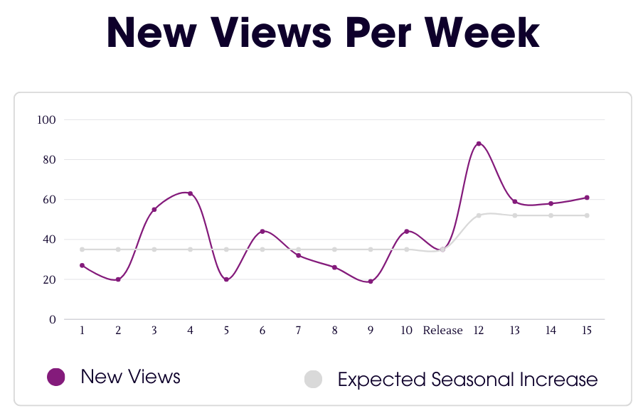
The revised view interface was rolled out as an opt-in experience. In the three weeks following launch, users with the new UI showed an 63% increase in view creation compared to the six weeks prior. While a seasonal increase in activity was expected (evidenced by a 49% increase in the control group using the legacy UI), the new design resulted in a 14 percentage point greater increase in view creation, directly addressing the project goal and significantly improving user engagement with data analysis features.